Branding my Support
I need some help from you all.
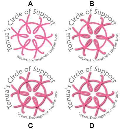
I had decided to create a logo t-shirt for everyone that is walking with/for me in the 5K Race for the Cure Walk in June. Then, I thought that some people might want it even if they're not walking with me. So, I've created a "Tonua's Circle of Support" logo. But, this is where I need your help. I've created four different versions (with minor differences) of this logo. So, I thought I would throw it out there to you and let you tell me if (a) you like the logo idea and (b) which variation you prefer.
(Can you tell I'm in marketing? Not only do I create a logo for my support group, but then I do market research on which one resonates best with my target market!)
posted by Tonua @ 9:38 AM
![]()
![]()

6 Comments:
Personally, I like "C". It has a nice 3-D effect.
I am fond of D myself.
I like "C". Darker color and stands out more...
-Pushpinder
D
-Rach
as in Tenacious D
-rach
I'm leaning towards A myself for the reasons you mention... I tried printing it out with the drop shadows and it looked all fuzzy. I also think the flower look gets lost with the drop shadows.
Post a Comment
<< Home